This is my photo for the paper strips/gesture drawing assignment.
Tuesday, October 26, 2010
Thursday, October 21, 2010
Blind Contour Drawing
On this assignment we had to draw 4 portraits using cante, ink with a brush, ink with a stick, and charcoal (or pencil).
I did the assignment as asked, and I think it turned out pretty good. The eyes were suppose to be on the side of the face, and the nose way out of proportion, right?
I liked blind contour drawing, but I feel it's a waste of paper. Those 2 ply bristol papers are expensive to only have one little scribble drawing on it. I feel we, the class, could have gotten the point with some regular paper and a charcoal pencil, or regular pencil. It would have been a lot cheaper.
Sunday, October 10, 2010
Planar Analysis Drawing - Done!
http://lifedrawingtwo.blogspot.com/
The assignments involving this weren't too hard, nor too easy. I think the most difficult part was the ruler. Making sure your sketched out, round lines looked like they were done with that huge t-square ruler ( I hate that thing).
And personally, for me, making the planes look like planes and not just squares was sort of difficult. I tend to zone out when I work, so I don't realize I'm doing what I'm doing until I get it in class, and I'm like: wow, this really sucks. Why did I do that?
A lot of my drawings for plane analysis looked similar to this: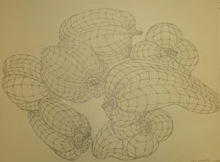

Lots and lots of little planes and not much line variation. Except my lines were darker and heavier, and I had more environment drawn. (no offense to the artist)
Now we get new assignments, no more ruler! Maybe this time around I'll do better, and live up to my own expectations.
Drapery Homework Assignment
This was my choice of cloth and object for the drapery assignment. I chose this because the crinkles in the sheet and the object were already there, and it would get the assignment done.
I didn't notice the little boxes on the sheet before, maybe that's why I went overboard on the planes in the actually drawing.
If I had a picture of the drawing I would post it, but... I don't :(
Monday, September 6, 2010
1 point, 2 point, 3 point
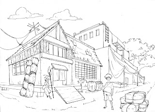
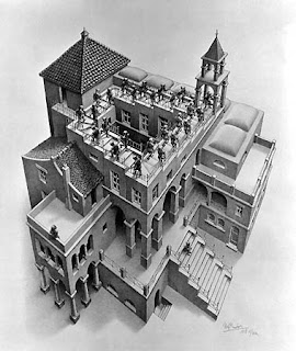
Examples of some artists using 1, 2, and 3 point perspective.
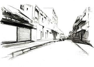 http://www.draw23.com/perspective

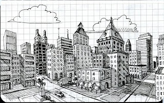
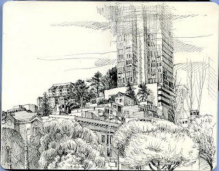
1 point perspective:

2 point perspective:
My favorite:

Tetsuya Ishida; http://curkovicartunits.pbworks.com/My-Surrealist-Room

Paul Heatson;

http://harvestart.blogspot.com/2010/04/two-point-perspective.html
3 point perspective:
My second favorite:

Paul Heatson;

M.C. Escher;
Thursday, August 26, 2010
The first homework assignment wasn't too bad. It could have been a lot worse.
The only challenging part of it all was doing the opposite on each line, looking at it all as a whole and making sure you didn't repeat a section of one line on the line below or above it. After a while it got repetitive, and I got lazy and just wanted to get it over with...
I'm not sure if I learned anything from it, maybe subconsciously I did?
Subscribe to:
Comments (Atom)


